KatSafe Web Alerts
Led the redesign of Sam Houston State University's emergency web alerts, a component of their KatSafe emergency alert system and preparedness program. This project was critical for increasing efficiency, mitigating the risk of compliance infringement, and restoring trust in the program.
As the project manager, designer, and front-end developer, I worked with subject matter experts and communication professionals responsible for publishing emergency alerts. Then, transferred project to another web developer for implementation.
Alert Levels
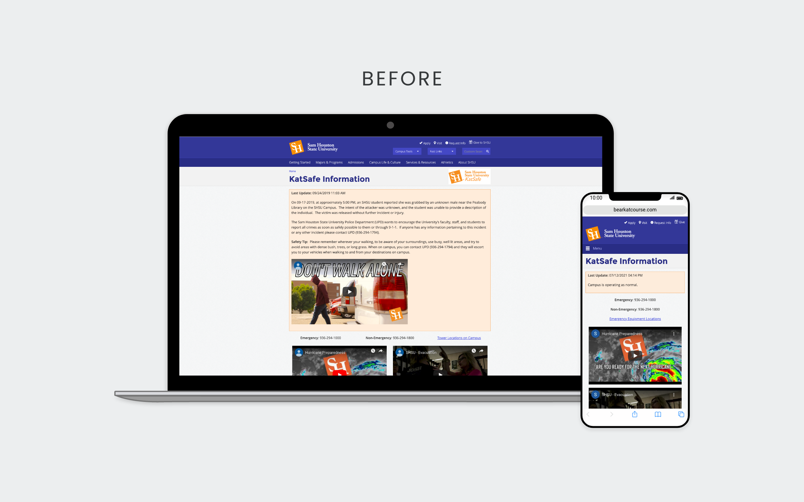
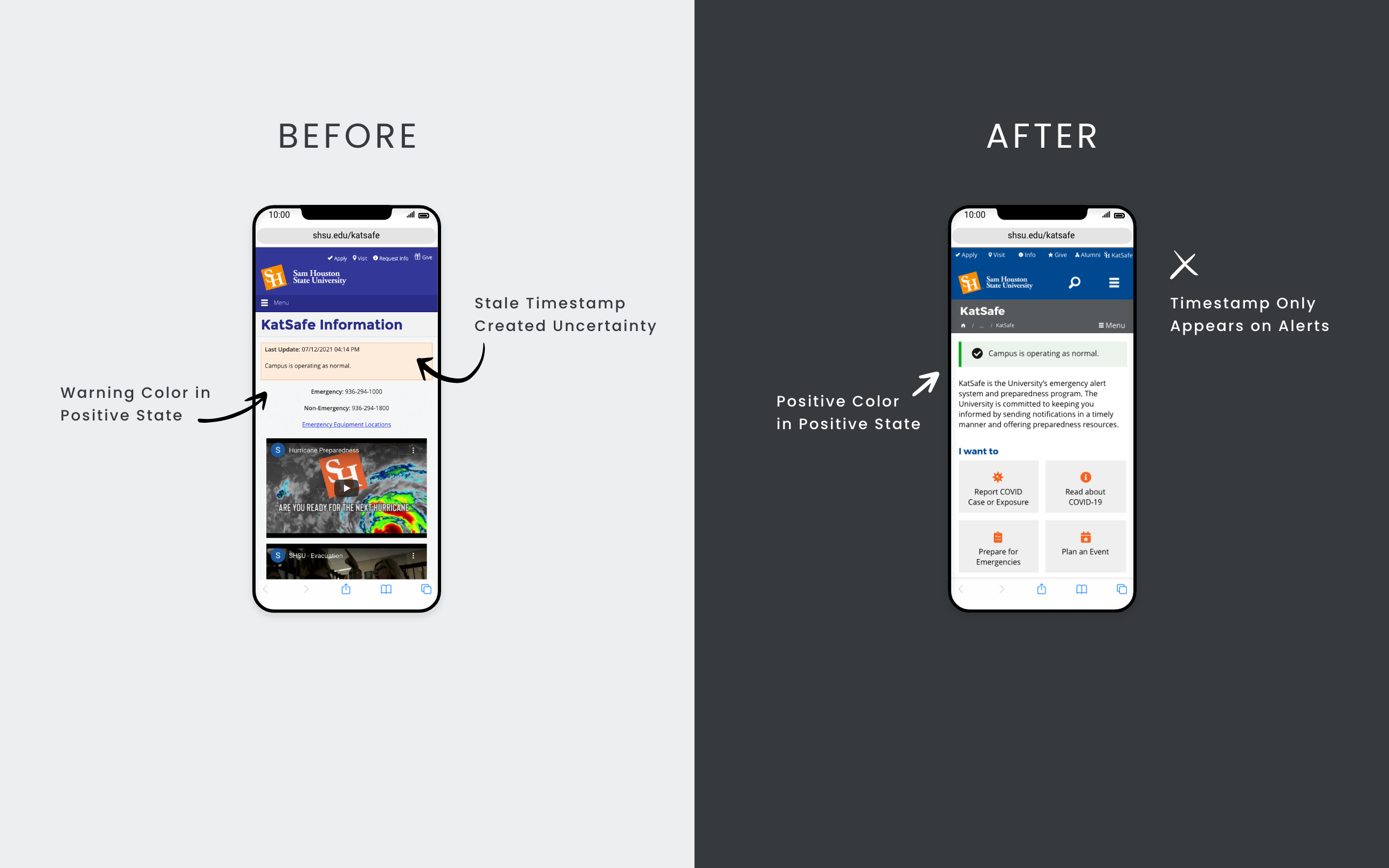
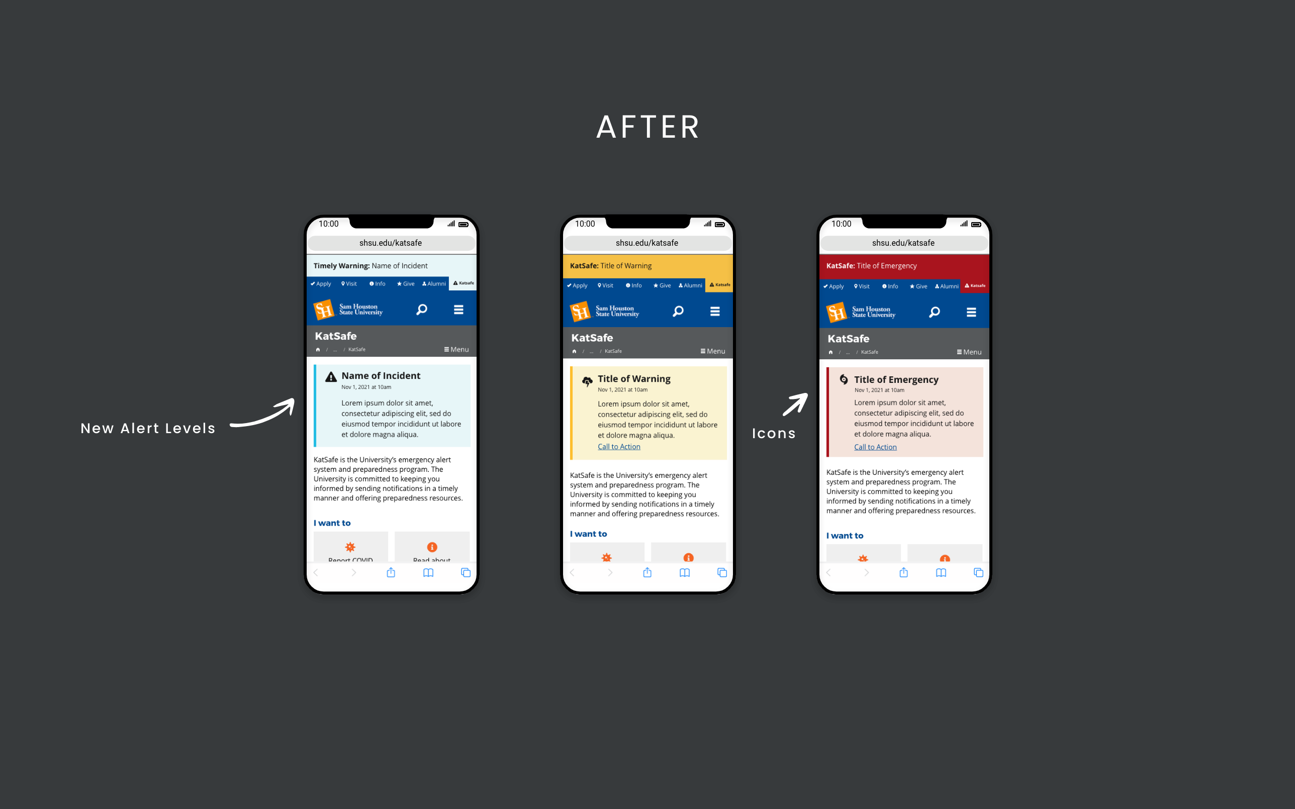
The old design showed one orange box on the program page even when the university was not experiencing or anticipating safety concerns. During an event, a red banner was manually added at the top of every page, regardless of how severe the situation was. This led users to ignore emergency notifications due to the frequency of precautionary messages and timely warnings. As a result, experienced users didn't take emergencies seriously, and new users overreacted to warnings. To fix this, I used the U.S. Web Design System (USWDS) to design different alert levels and worked with the project team to get everyone to define each level.
Normal
No emergency, precaution, or crime to report.Timely Warning
A reportable Clery Act crime occurred on or near campus. The campus community should take preventative measures to protect themselves.Warning
Dangerous conditions are possible or already occurring for the area campus but may impact the university’s regular operations. The campus community should take precautionary actions.Emergency
Dangerous conditions are expected or already occurring, limiting the university’s ability to operate. The community and/or affected individuals should take immediate action. Modified / Tossed
Alert Type
To help users respond quickly and categorize critical events for reporting, I created Alert Type in additional to Alert Level which determines the icon displayed on the program page.
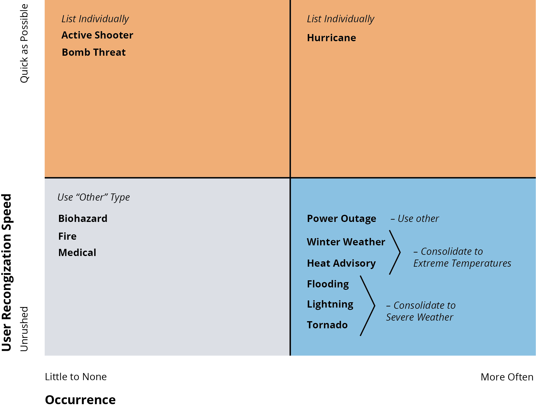
In the initial proposal to the project team, I selected icons for each alert type, often stacking icons for accuracy, sourced from Font Awesome. This resulted in 10 types. After hearing concerns about lengthy and confusing selection process from back-end users, I developed a matrix to reduce the selection to 6. This not only makes it faster to select options, but cleared up overlap between winter weather vs severe weather. However, the tradeoff resulted in loosing clarity and quick reporting on power outages and distinguishing weather types such as heat advisory over winter weather. During discussion, fire was moved to low user recognition speed as web alerts are typically used to report after, relying on text, phone, and ground support for immediate response.
Features
Stackable
Designed for clear display of multiple alerts. The old design's single bounding box made it challenging to distinguish between alert types, especially during Hurricane Harvey when the team posted updates on dining and housing services alongside weather information. In emergencies, users may feel confused or frustrated by a timely warning interwined with other information.
Expiration
Designed to automatically unpublish when expiration time is set. The old design relied on a person to remember to unpublish, leaving notifications up too long. This leads to desensitiving and ad blindness. This extermely helpful for weather watches in effect until a specific hour and timely warnings. Not only is this improve the university's reputation but increase efficiency for the communication and public safety teams.
Form Entry
Created form experience to create a post for consistency and efficiency. The old design provided a blank WYISWIG editor. This leads to inconsistency, accessibility errors, lack of responsiveness, and requires extra time to post.
Automated Banner
Designed to automatically display banners on every page without developers having to do it manually during events. Using a custom component in our content management system, we ensure consistency and saves effort by posting notices automatically. This removed issues when developers are unavailable and allows more focus on innovation.
Responsive Images
Designed to post up to 3 images responsively. WYISWIG editor does not allow customization based on screen size.
Record Retention
Created to maintain a readily available history of postings in a dashboard view within our content management system. In the previous design, the communication and public safety teams had to take screenshots of each posting during emergencies to comply with the Clery Act. Now, these teams can export a CSV file with the posting time within seconds after logging in.
Key Takeaways
- Improved clarity for users through alert levels, icons, and the separation of notices.
- Maintain freshness with automatic expiration and removal of the last updated date during the normal state.
- Reduce operational risk with automatic record retention.
- Enable quicker publishing through form-styled entry and automatic banner publication.