Bearkat Course Website
bearkatcourse.com the official golf course website of Sam Houston State University launched in October 2021 in support of their rebrand from Raven Nest Golf Courses.
Project Overview
Problem
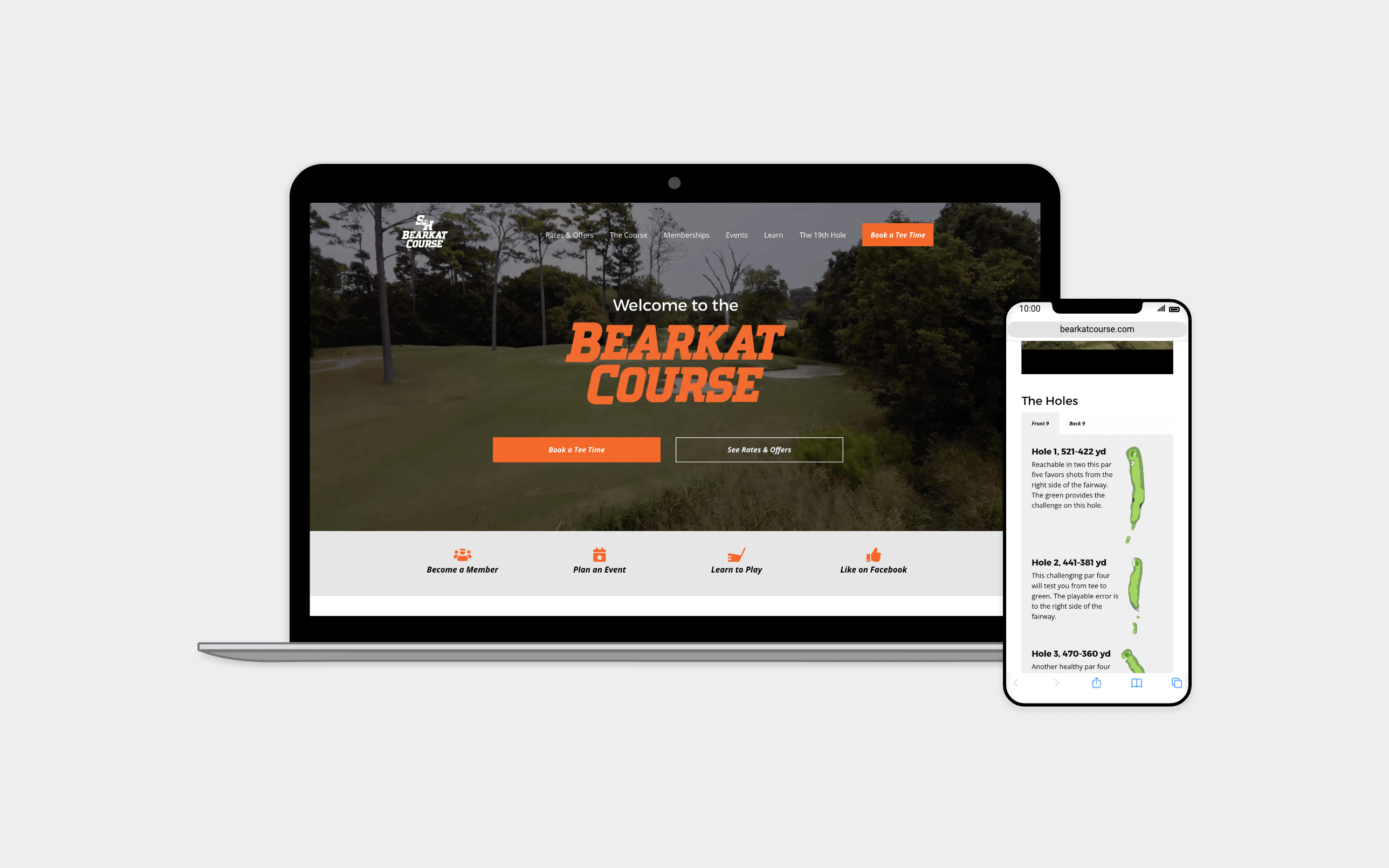
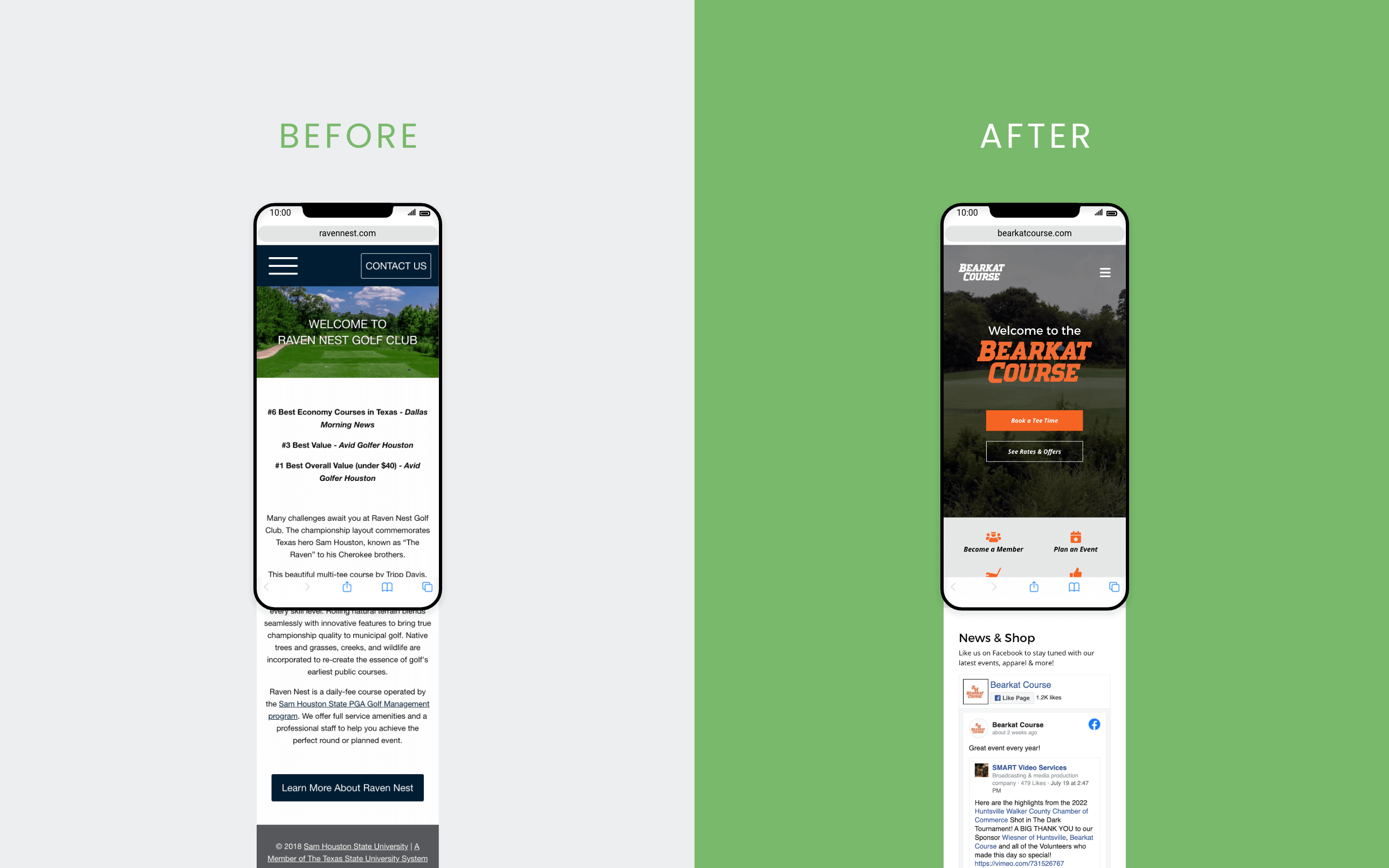
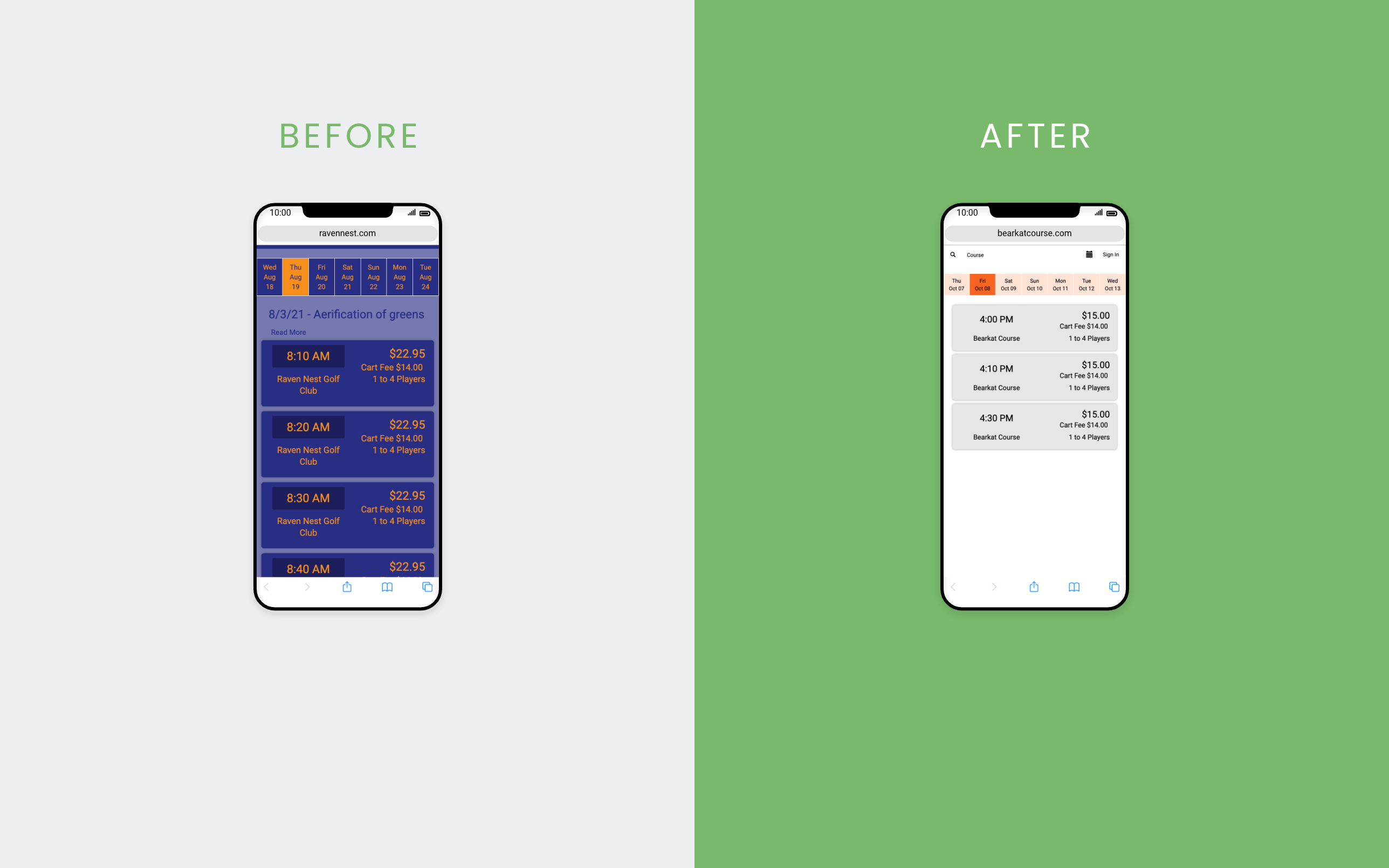
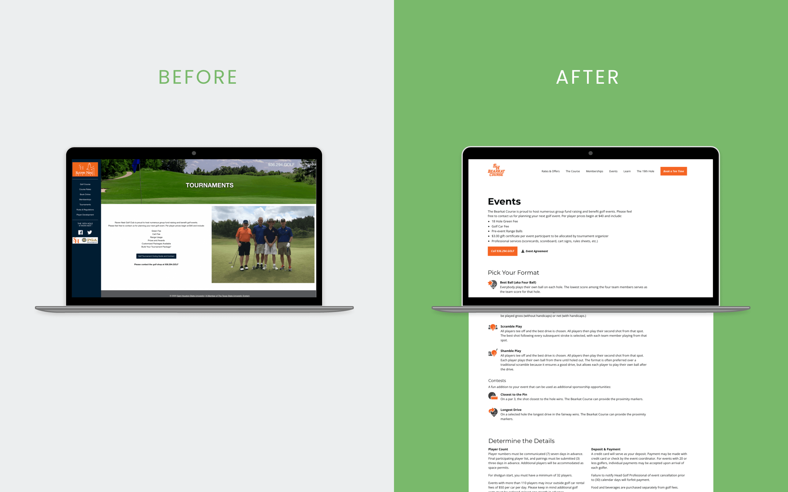
While the course was recognized by multiple news outlets for its value, the website was not showing its beauty! It lacked fresh photos and call-to-actions to drive revenue. It also clashed with university brand colors and navigational design trends.
Goal
Develop new website to support rebrand from Raven Nest to Bearkat Course and increase conversations by driving users to book tee times online, purchase a membership, plan an event, and register for clinics/workshops.
Roles
With lean UX practices, I faciliated project management, research, design, development, and video editing. The Sam Houston State University (SHSU) IT team configured the hosting and domain, while the SHSU golf course manager was responsible for providing feedback and contracting photography services. Lastly, the SHSU Marketing & Communications team filled in content gaps.
Audience
Their primary audience is experienced locals, high school students looking to learn, and college students majoring in golf. With the new site design and rebrand, we hoped to also reach more inexperienced college students.
Process Highlights
Competitor Analysis
With a handful of golf courses in the area, I reviewed competitor sites to identify design patterns and user expectations. Across these competitors, I noticed:
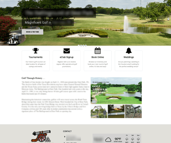
Low content
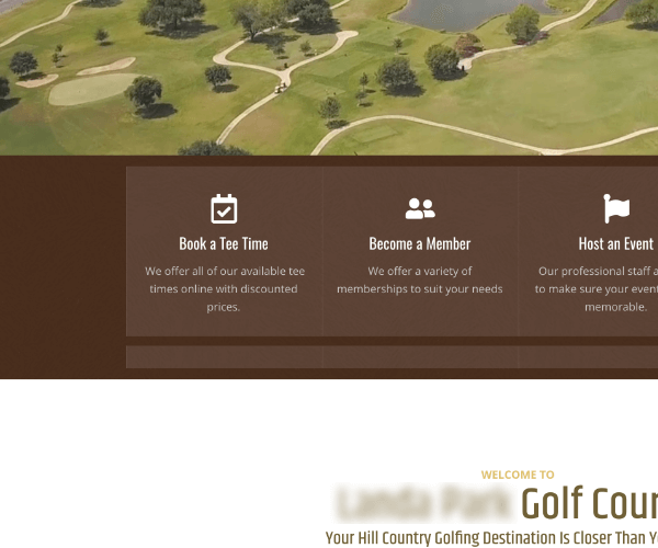
Links to "Book a Tee Time " and "Become a Member "
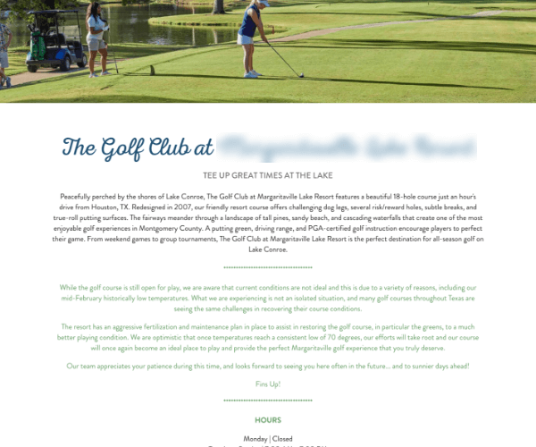
Description of the course
Photos of the course
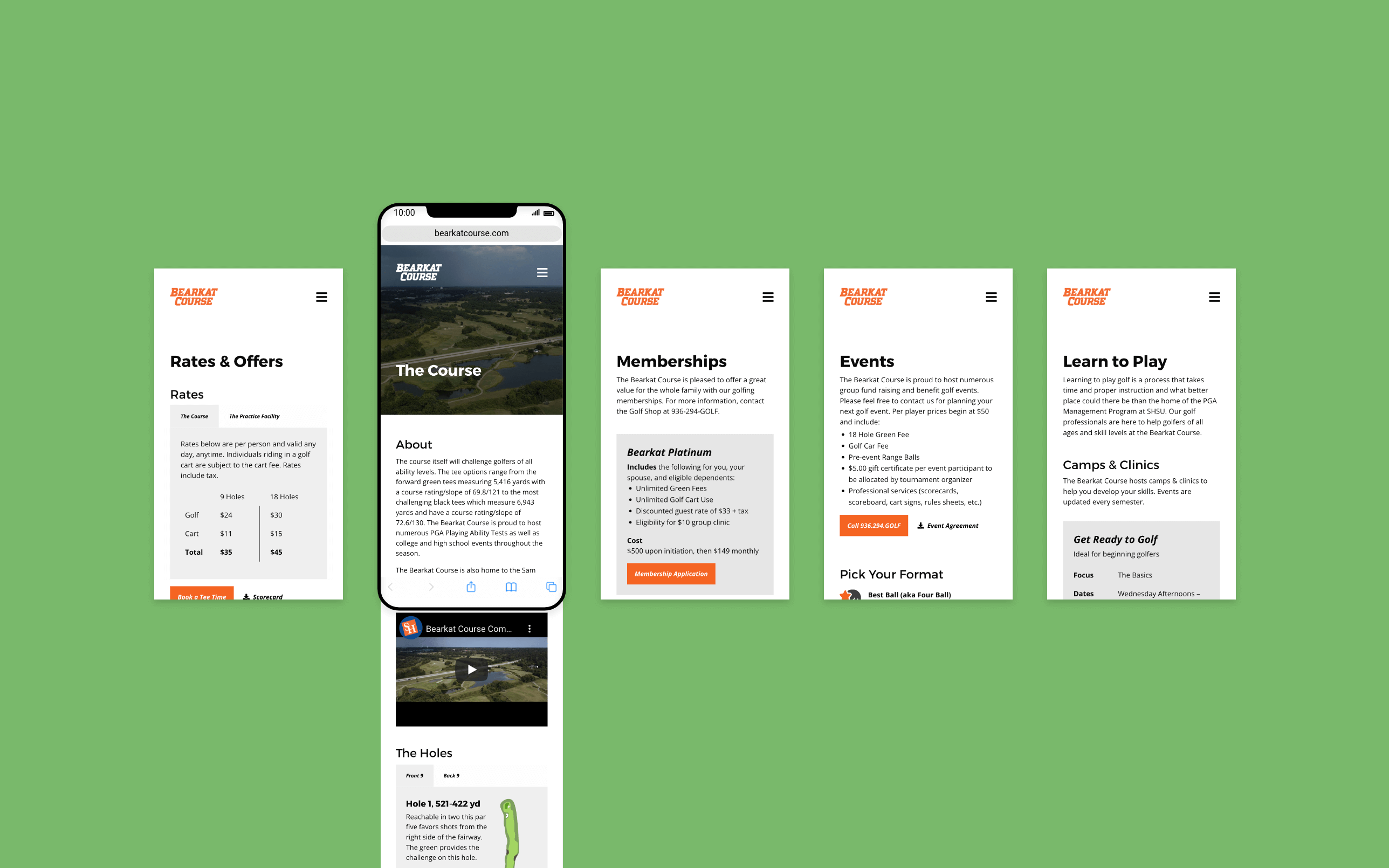
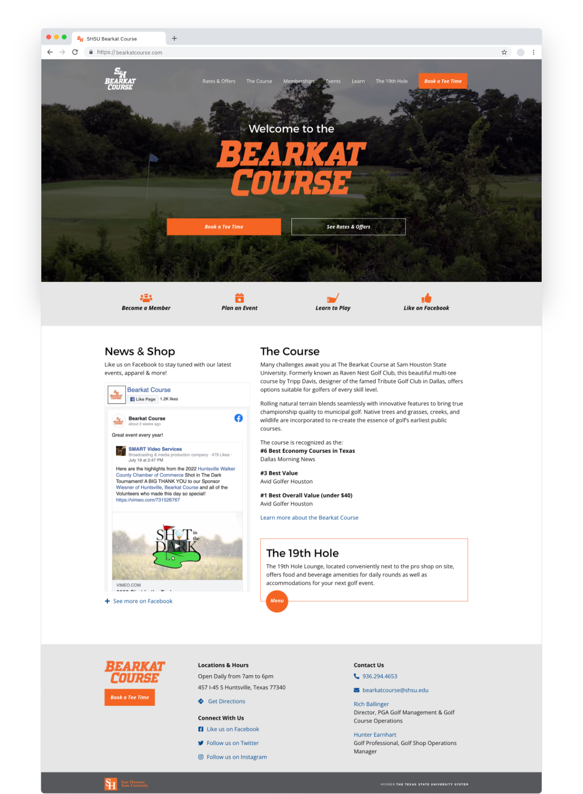
The Bearkat Course homepage includes these design patterns with a brief description of the course, multiple buttons to book a tee time online, and a button to the membership page underneath a video of the golf course.
Content
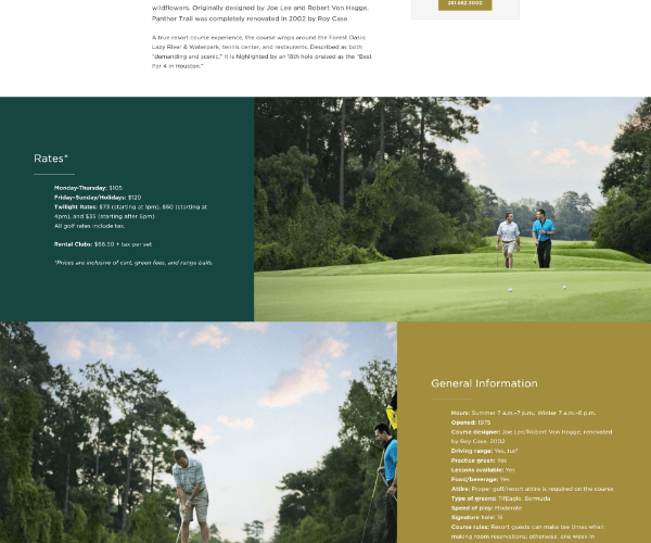
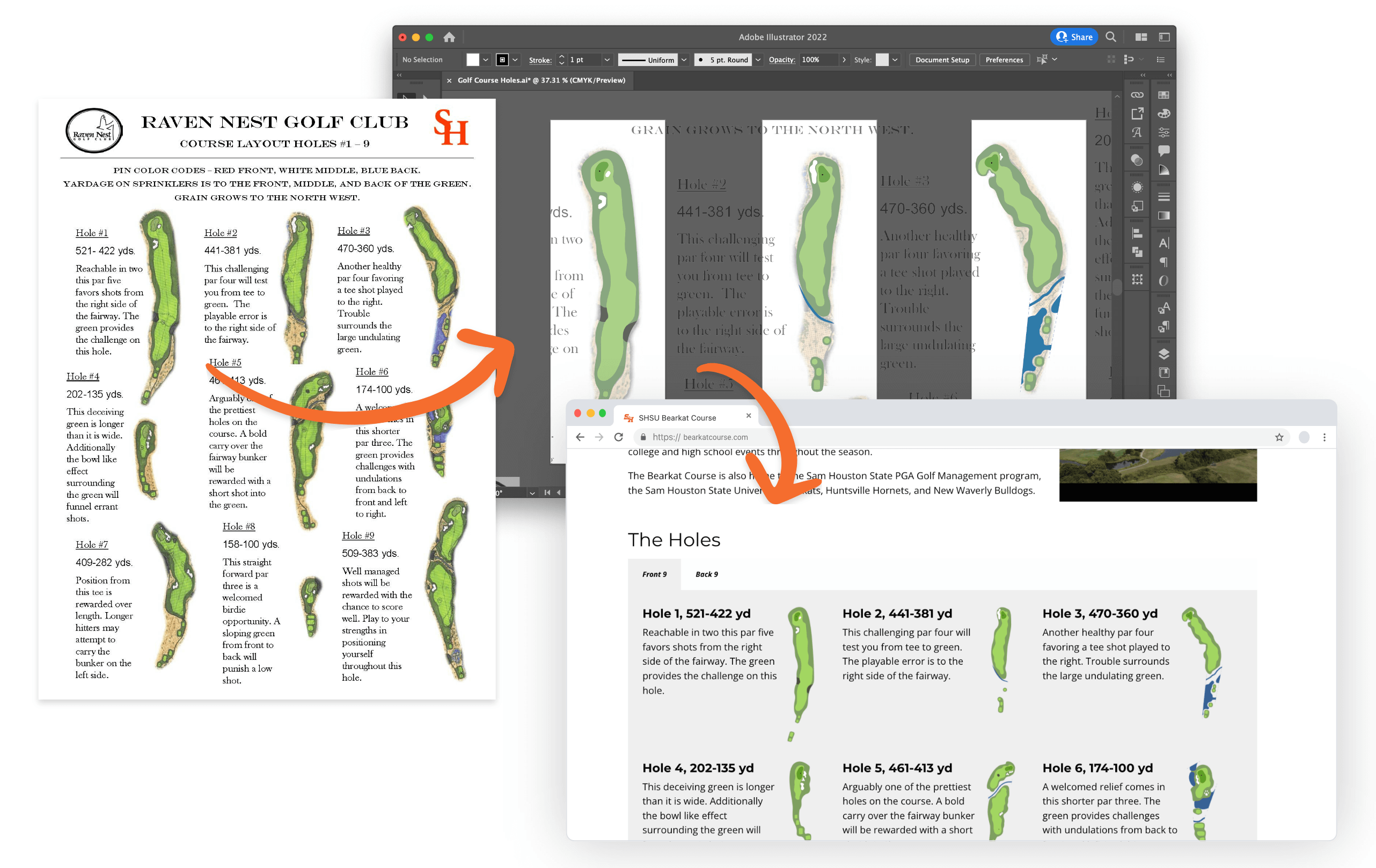
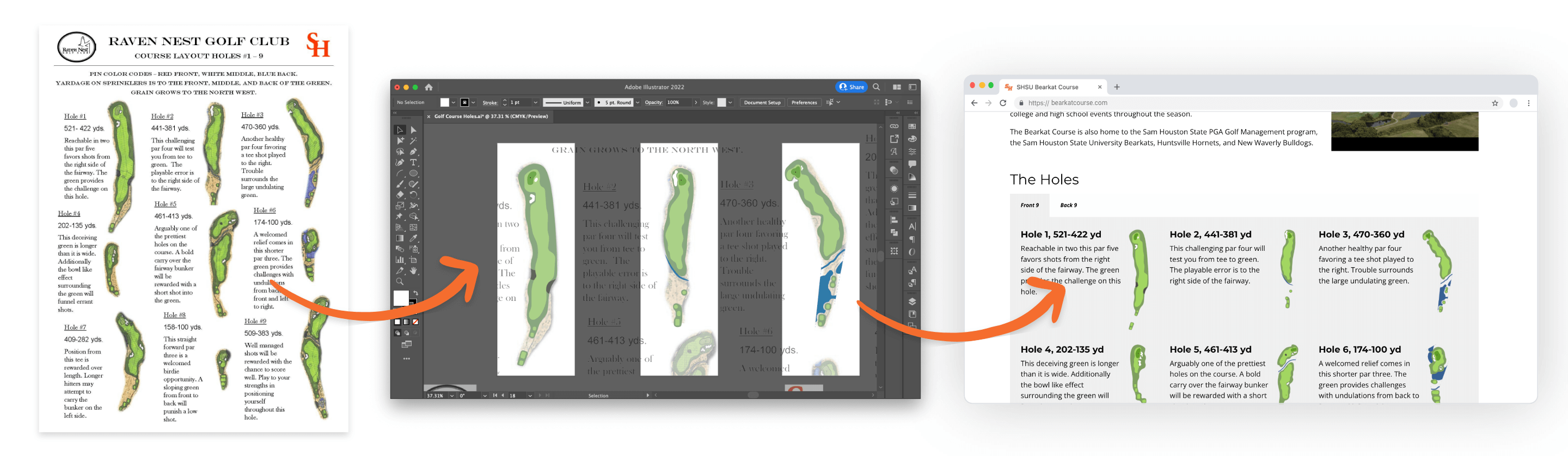
Content can make or break a project because the design is contingent on the amount of content available. Often, there is not a dedicated resource available to create content. During a content audit, I discovered content buried in PDFs on the old site that could be repurposed for the new site.
For example, “The Holes” section on “The Course” page was created from an old PDF by rendering the holes with Adobe Illustrator and exporting them individually into web files. The course descriptions were already perfect to incorporate into the page.
Design
The design step includes sketching to jot down ideas quickly, wireframing to test a few options in an outline format, and prototyping to capture feedback. With 18 holes to display on a mobile screen, I explored different ways to stack and group them to break up the endless scroll. With Miller’s law and golfing practices in mind, I created 2 groups of 9 holes. Miller’s law states that our working memory can hold up to 9 items with low complexity, while golfers looking for a short round of golf may only play the front 9 or the back 9.
Try Prototype! See All Wireframes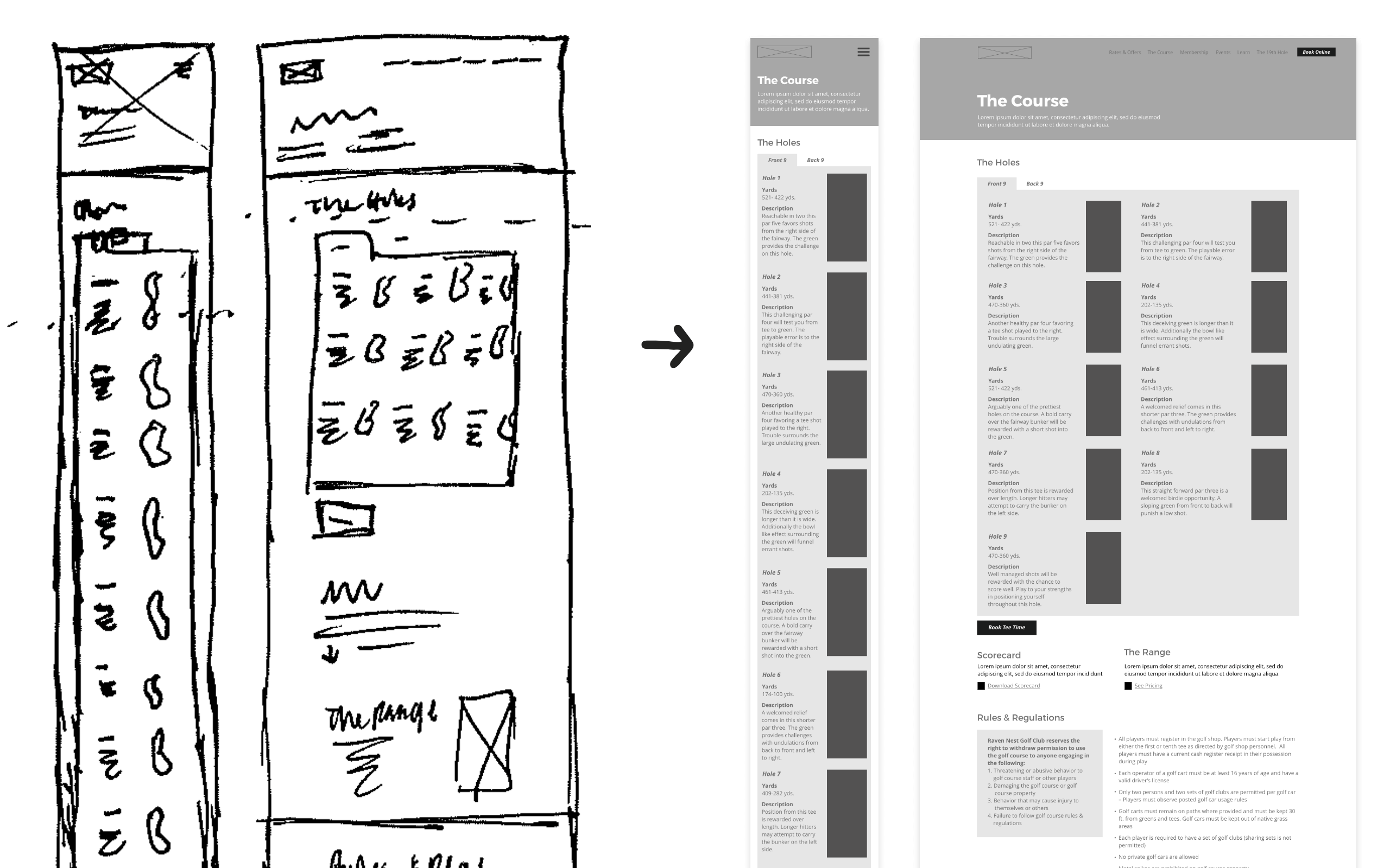
What I Learned
- Avoid rendering every screen size. During the wireframe design step, I rendered every screen size to show the client how content would unfold. But, clients do not need the breakdown of every screen to understand nor will they take the time to review every screen. A lot of time can be saved by focusing on the common screen size.
- How to build templates in dotCMS verison 3.7.2. Templates are ideal for updating repetitive elements and creating consistency.
- Add time to update assets. To complete the web experience, forms, photos, videos, and graphics need to be updated too! Even though the video reel on the home page was new, it was not ready to publish and required some video editing to adjust color and trim to desired length. Forms also required updating to align with new brand and allow users to complete electronically.
- Embed pre-existing channels. To keep the site fresh with news, I embedded their Facebook channel so that would not have to change their habits to update their website with news and quickly changing shop inventory. But, I can't take credit for this idea!
- Reallocate content, not reinvent. I was able to reuse a lot of content from the old site by digging through flat PDFs and restructuring the content architecture.
Check out the live site! Visit bearkatcourse.com